I’m testing the docker and I’ve built the graphs with the following config: https://termbin.com/y9jn5
But what I get is the red area in https://i.imgur.com/jkhCeTq.png while the green area is the same result but coming from server api_openrouteservice_org
which looks quite similar to what your own installation yields.
Could you provide the full code you’re using to issue your request?
Unless we’re able to reproduce your issue, there’s not too much we can do…
Best regards,
Jakob
which has a similar shape as the api-response from your screenshot, but is on a completely different street.
Please make sure that you are indeed using the same request and visualizing the corresponding results when comparing a local setup to api.openrouteservice.org
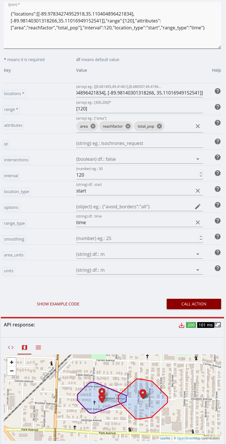
Sorry, I can’t reproduce right now because of OOM errors but the original picture shows the issue. My gut feeling is that my graph takes driving directions into account while the official API doesn’t, the area is approximately the same but the red area is oriented west from the starting point while the official one goes in both directions.
Is there anything in my config that might explain that?
Forgot to mention that I’m 100% sure the request was exactly the same, just sent to two different endpoints (mines and the official one): it was generated by a script.
Ok, I was able to fix the OOM errors and here is the new image that compares my result (in red) and official one in blue) https://i.imgur.com/zEXjp6c.png
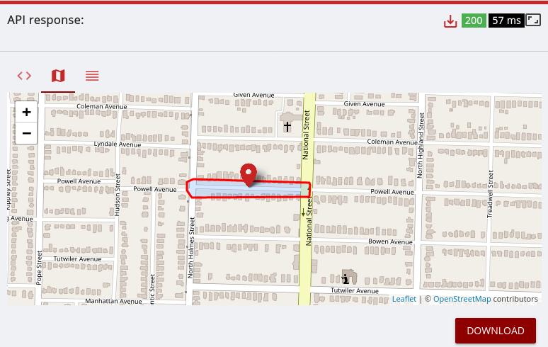
Ok, maybe it’s not the one-way tag, it seems like the points are snapped to the nearest node (intersection). Sorry, I’m a bit in the dark here, just guessing.